MaterialDesign3から塗りつぶしボタン(FilledButton)と外枠ボタン(OutlinedButton)が標準装備されたみたいなので使ってみました。
【Flutter】FilledButton と OutlinedButton
事前設定
MaterialAppのtheme: ThemeData()でuseMaterial3: trueを指定してMaterialDesign3を適用します。
class MyApp extends StatelessWidget {
  const MyApp({super.key});

  @override
  Widget build(BuildContext context) {
    return MaterialApp(
      title: 'Flutter Demo',
      theme: ThemeData(
        useMaterial3: true,
        primarySwatch: Colors.blue,
      ),
      home: const MyHomePage(),
    );
  }
}
FilledButton
シンプルなパターン
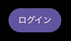
FilledButton(onPressed: () {}, child: const Text('ログイン'))アイコン付き
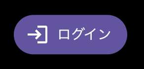
FilledButton.icon(onPressed: () {}, icon: const Icon(Icons.login), label: const Text('ログイン'))文字と背景の色反転
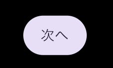
FilledButton.tonal(onPressed: () {}, child: const Text('次へ'))OutlinedButton
シンプルなパターン
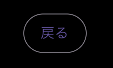
OutlinedButton(onPressed: () {}, child: const Text('戻る'))アイコン付き
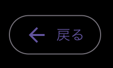
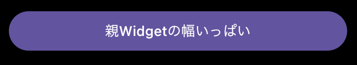
OutlinedButton.icon(onPressed: () {}, icon: const Icon(Icons.arrow_back), label: const Text('戻る'))親Widgetの横幅いっぱいに表示する
ボタンの横幅はchildの幅に依存するため、親Widgetの横幅いっぱいに表示したい場合はSizedBoxで包んでwidthにdouble.infinityを指定しましょう。
SizedBox(
  width: double.infinity,
  child: FilledButton(onPressed: () {}, child: const Text('親Widgetの幅いっぱい')),
)
以上


コメントを残す