新しいプログラミング言語を習得する時、私の場合、先ずは何かしら動くものを作ってみることから始めてそれから各レイアウト要素や詳細なロジック部分の理解を深めていきます。
「木を見て森を見ず」と言う言葉がありますが、まさにそうだなといつも感じています。
と言うことで、手っ取り早く Flutter の感触を掴むために公式ドキュメントのチュートリアルを写経してみました。
各レイアウト要素の詳細については、それぞれを別の記事でまとめていこうと思っていますので、今回は、気になったところ、他の言語との違いなど、ポイントをかいつまんで解説(感想?)を書いて見ます。
【Flutter入門】公式ドキュメントのチュートリアルをやってみる①【Building layouts編】
いきなりですが、以下がチュートリアルのコードの全貌です。
写経した元のコードはこちらのGitHubリポジトリになります。
import 'package:flutter/material.dart';

void main() {
  runApp(MyApp());
}

class MyApp extends StatelessWidget {
  @override
  Widget build(BuildContext context) {

    Widget titleSection = Container(
      padding: const EdgeInsets.all(32),
      child: Row(
        children: <Widget>[
          Expanded(
            child: Column(
              crossAxisAlignment: CrossAxisAlignment.start,
              children: <Widget>[
                Container(
                  padding: const EdgeInsets.only(bottom: 8),
                  child: Text(
                    'Oeschinen Lake Campground',
                    style: TextStyle(
                      fontWeight: FontWeight.bold,
                    ),
                  ),
                ),
                Text(
                  'Kandersteg, Switzerland',
                  style: TextStyle(
                    color: Colors.grey[500],
                  ),
                ),
              ],
            ),
          ),
          Icon(
            Icons.star,
            color: Colors.red[500],
          ),
          Text('41'),
        ],
      ),
    );

    Color color = Theme.of(context).primaryColor;

    Widget buttonSection = Container(
      child: Row(
        mainAxisAlignment: MainAxisAlignment.spaceEvenly,
        children: <Widget>[
          _buildButtonColumn(color, Icons.call, 'CALL'),
          _buildButtonColumn(color, Icons.near_me, 'ROUTE'),
          _buildButtonColumn(color, Icons.share, 'SHARE'),
        ],
      ),
    );

    Widget textSection = Container(
      padding: const EdgeInsets.all(32),
      child: Text(
        'Lake Oeschinen lies at the foot of the Blüemlisalp in the Bernese '
            'Alps. Situated 1,578 meters above sea level, it is one of the '
            'larger Alpine Lakes. A gondola ride from Kandersteg, followed by a '
            'half-hour walk through pastures and pine forest, leads you to the '
            'lake, which warms to 20 degrees Celsius in the summer. Activities '
            'enjoyed here include rowing, and riding the summer toboggan run.',
        softWrap: true,
      ),
    );

    return MaterialApp(
      title: 'Flutter layout demo',
      home: Scaffold(
        appBar: AppBar(
          title: Text('Flutter layout demo'),
        ),
        body: ListView(
          children: <Widget>[
            Image.asset(
              'images/lake.jpg',
              width: 600,
              height: 240,
              fit: BoxFit.cover,
            ),
            titleSection,
            buttonSection,
            textSection,
          ],
        ),
      ),
    );
  }

  Column _buildButtonColumn(Color color, IconData icon, String label) {
    return Column(
      mainAxisSize: MainAxisSize.min,
      mainAxisAlignment: MainAxisAlignment.center,
      children: <Widget>[
        Icon(icon, color: color),
        Container(
          margin: const EdgeInsets.only(top: 8),
          child: Text(
            label,
            style: TextStyle(
              fontSize: 12,
              fontWeight: FontWeight.w400,
              color: color
            ),
          ),
        ),
      ],
    );
  }
}当然ですが、ただコピペして実行しただけでは何も得られません。
特にプログラミング初心者の方は必ず一言一句打ち込んで見ることをお薦めします。
ただ書いただけでも、言語の癖や他の言語との違いを感じ取ることができるはずです。
Flutter は全てを Dart で書ける
iOS の storyboard しかり、Android の xml しかり、これまでのアプリ開発では、ロジック部分とレイアウト部分を異なる言語で記述しなければいけませんでした(storyboard は言語というよりGUIですが)。
しかし、Flutter ではロジックはもちろんのこと、レイアウト要素もDart言語で記述することができ、これまでの開発手順より労力が大分減ったと感じています。
アプリ開発初学者にもお薦めしやすい言語だと思います(筆者自身 storyboard で苦しんだ経験があるので)。
所謂、「宣言的」なプログラミング言語と言ってよいかと思います。
同じく、「宣言的」で思想の近いものとして SwiftUI が挙げられます。こちらも Swift 言語だけでレイアウトとロジックの両方を書くことができます。
余談ですが、本ブログでは SwiftUI の記事も多数掲載していますのでご興味ありましたら是非ご覧ください。
全てのレイアウト要素は「Widget 」である
SwiftUI のレイアウト要素は全て「Viewプロトコル」を継承しています。
Flutter も同様で、全てのレイアウト要素は「Widget」クラス(abstract class)を継承していて、ボタンや画像要素はもちろんのこと、画面のページ全体(AndroidでいうActivityやFragment)や、要素の配置ルール(LinearLayoutやFrameLayout)なども Widget の一つです。
レイアウトを構成する全ての要素を同じ祖先とすることで、レイアウトだけのクラスとその他の制御クラスを明確に分けることが容易になり、所謂、手続き的なコードを回避することが言語思想としてあるように感じています。
よくある不具合で、実際の値とそれを表示している画面要素にズレが生じるというものがあります。
これまで RxSwift などのリアクティブプログラミングの手法でこれを回避するようなライブラリが開発されてきました。
非常に便利で革新的な印象を受けましたが、iOSやAndroid標準の機能ではなく、元々の一般的なコーディング手法と一線を画す技術であるため若干学習コストが高い印象でした。
しかし、SwiftUI や Flutter では、この部分が標準機能として搭載され、Flutter では状態を保持させることができる Widget(StatefulWidget)が存在します。
全ての画面要素が Widget であることで、レイアウト部分を一箇所に集約したコードが書けるようになり、更にそれらレイアウトの状態変化のロジック部分もまた、別のクラスに集約することが出来ます。
これまでの、UIViewController や Activity と言った制御系クラスと、ボタンなどのレイアウト要素が混在したコードをなくすことが可能になりました。
「Building layouts」の全体構成
今回のチュートリアルコードの大まかな構成要素は以下のようになっています。
- エントリーポイント:main
- アプリケーションWidget:MyApp・MaterialApp
- イメージWidget:Image
- タイトルセクションWidget:titleSection
- ボタンセクションWidget:buttonSection
- テキストセクションWidget:textSection
アプリケーションWidget:MyApp・MaterialApp
アプリケーションのエントリーポイントである main関数 でアプリケーションのメインWidgetである MyApp を指定しています。
void main() {
  runApp(MyApp());
}
MyApp では MaterialApp を生成し、内部ではアプリケーションバーとレイアウトのBody要素を生成しています。勿論 MaterialApp も Widget の1つです。
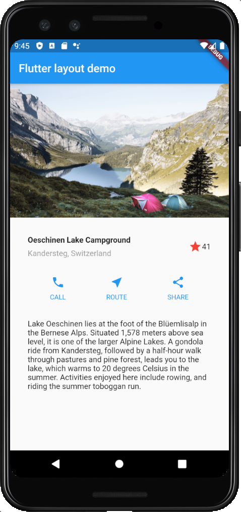
Body要素の子Widgetには、画像(Image)・タイトル(titleSection)・ボタン群(buttonSection)・本文(textSection)がレイアウトされています。
全体を ListView でレイアウトしているのは、画面が小さい端末の場合で入りきらない時にスクロールするように配慮しているようです。
class MyApp extends StatelessWidget {
  @override
  Widget build(BuildContext context) {
・
・
・
    return MaterialApp(
      title: 'Flutter layout demo',
      home: Scaffold(
        appBar: AppBar(
          title: Text('Flutter layout demo'),
        ),
        body: ListView(
          children: <Widget>[
            Image.asset(
              'images/lake.jpg',
              width: 600,
              height: 240,
              fit: BoxFit.cover,
            ),
            titleSection,
            buttonSection,
            textSection,
          ],
        ),
      ),
    );
  }
}イメージWidget:Image
Image.asset(
  'images/lake.jpg',
  width: 600,
  height: 240,
  fit: BoxFit.cover,
),
内部に保持しているjpg画像をレイアウトしています。
タイトルセクションWidget:titleSection
画像の下部にある、タイトルとお気に入りアイコンの部分をレイアウトしています。
左右上下に32ptの余白を設けています。
アイコンは Image ではなく Icon という独立した Widget になっているところが SwiftUI と違うところですね。
Widget titleSection = Container(
  padding: const EdgeInsets.all(32),
  child: Row(
    children: <Widget>[
      Expanded(
        child: Column(
          crossAxisAlignment: CrossAxisAlignment.start,
          children: <Widget>[
            Container(
              padding: const EdgeInsets.only(bottom: 8),
              child: Text(
                'Oeschinen Lake Campground',
                style: TextStyle(
                  fontWeight: FontWeight.bold,
                ),
              ),
            ),
            Text(
              'Kandersteg, Switzerland',
              style: TextStyle(
                color: Colors.grey[500],
              ),
            ),
          ],
        ),
      ),
      Icon(
        Icons.star,
        color: Colors.red[500],
      ),
      Text('41'),
    ],
  ),
);ボタンセクションWidget:buttonSection
アイコンのボタンを子要素に3つ持つコンテナWidgetを定義しています。
アイコンボタンの要素は別の共通のWidgetとして _buildButtonColumn を定義しています。
Row Widget で横並びに配置しているところがポイントです。
Color color = Theme.of(context).primaryColor;

Widget buttonSection = Container(
  child: Row(
    mainAxisAlignment: MainAxisAlignment.spaceEvenly,
    children: <Widget>[
      _buildButtonColumn(color, Icons.call, 'CALL'),
      _buildButtonColumn(color, Icons.near_me, 'ROUTE'),
      _buildButtonColumn(color, Icons.share, 'SHARE'),
    ],
  ),
);
Column _buildButtonColumn(Color color, IconData icon, String label) {
return Column(
mainAxisSize: MainAxisSize.min,
mainAxisAlignment: MainAxisAlignment.center,
children: <Widget>[
Icon(icon, color: color),
Container(
margin: const EdgeInsets.only(top: 8),
child: Text(
label,
style: TextStyle(
fontSize: 12,
fontWeight: FontWeight.w400,
color: color
),
),
),
],
);
}テキストセクションWidget:textSection
本文のレイアウト部分です。
左右上下に32ptの余白を設定しています。
Widget textSection = Container(
  padding: const EdgeInsets.all(32),
  child: Text(
    'Lake Oeschinen lies at the foot of the Blüemlisalp in the Bernese '
    'Alps. Situated 1,578 meters above sea level, it is one of the '
    'larger Alpine Lakes. A gondola ride from Kandersteg, followed by a '
    'half-hour walk through pastures and pine forest, leads you to the '
    'lake, which warms to 20 degrees Celsius in the summer. Activities '
    'enjoyed here include rowing, and riding the summer toboggan run.',
    softWrap: true,
  ),
);
以上、「Building layouts」チュートリアルをやって見ての感想と簡単な解説でした。
他のチュートリアルについても今後記事にしていこうと思います。

コメントを残す