今回は Button系の Widget をについて学習して行きます。
目次
- FlatButton
- RaisedButton
- OutlineButton
- IconButton
- FloatingActionButton
尚、Button と名のつく Widget に PopupMenuButton・DropdownButton という物もありますが、ボタンというより選択肢表示の Widget なので今回は学習範囲から外しています。
【Flutter入門】Button系 Widget まとめ
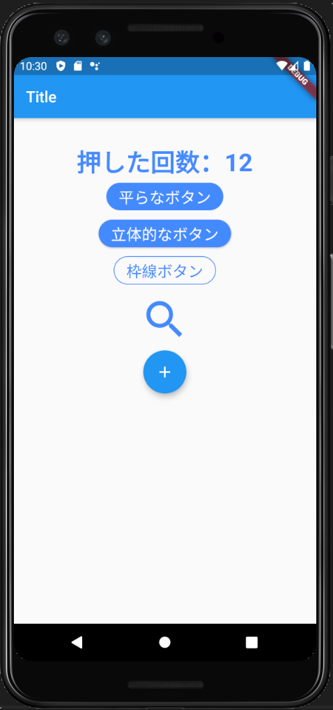
今回は5種類全てのボタンに onPressed: に押下時のアクションとして、_handleButtonPressed を指定しており、簡単な例として押した回数をカウントするようにしています(全体のコードは最後に紹介します)。
FlatButton
立体感の無い平らなボタンです。
shape: RoundedRectangleBorder を設定し角丸のボタンとしています。
使用例)
FlatButton(
  onPressed: _handleButtonPressed,
  color: Colors.blueAccent,
  shape: RoundedRectangleBorder(
    borderRadius: BorderRadius.circular(20)
  ),
  child: Text(
    '平らなボタン',
    style: TextStyle(
      color: Colors.white,
      fontSize: 20,
    ),
  ),
),
RaisedButton
やや背後に影が掛かっている立体的なボタンです。とはいえ微妙な違いです。
設定内容は FlatButton と全く同じです。
RaisedButton(
  onPressed: _handleButtonPressed,
  color: Colors.blueAccent,
  shape: RoundedRectangleBorder(
    borderRadius: BorderRadius.circular(20)
  ),
  child: Text(
    '立体的なボタン',
    style: TextStyle(
      color: Colors.white,
      fontSize: 20,
    ),
  ),
),
OutlineButton
塗り潰しの無い外枠だけのボタンです。
borderSide: を設定することで枠線の色・太さ・スタイルを変えることが出来ます。
BorderSide() の style: に BorderStyle.none を指定することで枠線の無いボタンにすることも出来ます。
OutlineButton(
  onPressed: _handleButtonPressed,
  shape: RoundedRectangleBorder(
    borderRadius: BorderRadius.circular(20),
  ),
  borderSide: BorderSide(
    color: Colors.blueAccent,
    width: 1,
    style: BorderStyle.solid,
  ),
  child: Text(
    '枠線ボタン',
    style: TextStyle(
      color: Colors.blueAccent,
      fontSize: 20,
    ),
  ),
),
IconButton
その名の通り、アイコン画像を設定したボタンを作れます。
iconSize: で大きさを変えられます。
IconButton(
  iconSize: 64,
  onPressed: _handleButtonPressed,
  color: Colors.blueAccent,
  icon: Icon(Icons.search),
),
FloatingActionButton
少し、浮き上がったようなデザインの円ボタンです。
Gmailアプリの新規メールボタンや、メルカリの出品ボタンなど、画面右下に置かれることが多いです。
FloatingActionButton(
  onPressed: _handleButtonPressed,
  child: Icon(Icons.add),
),
【Flutter入門】Button系 Widget まとめ【全体コード】
最後の冒頭キャプチャ画面のソースコード全体を紹介して終わります。
import 'package:flutter/material.dart';

void main() {
  runApp(MyApp());
}

class MyApp extends StatelessWidget {
  @override
  Widget build(BuildContext context) {
    return MaterialApp(
      title: 'Test App',
      home: Scaffold(
        appBar: AppBar(
          title: Text('Title'),
        ),
        body: Center(
          child: TestPage(),
        ),
      ),
    );
  }
}

class TestPage extends StatefulWidget {
  @override
  _TestPageState createState() => _TestPageState();
}

class _TestPageState extends State<TestPage> {

  int _counter = 0;

  void _handleButtonPressed() {
    setState(() {
      _counter++;
    });
  }

  Widget build(BuildContext context) {
    return Container(
      padding: const EdgeInsets.all(32),
      child: Column(
        children: <Widget>[
          Text(
            '押した回数:$_counter',
            style: TextStyle(
              color: Colors.blueAccent,
              fontSize: 32,
              fontWeight: FontWeight.bold,
            ),
          ),
          FlatButton(
            onPressed: _handleButtonPressed,
            color: Colors.blueAccent,
            shape: RoundedRectangleBorder(
              borderRadius: BorderRadius.circular(20)
            ),
            child: Text(
              '平らなボタン',
              style: TextStyle(
                color: Colors.white,
                fontSize: 20,
              ),
            ),
          ),
          RaisedButton(
            onPressed: _handleButtonPressed,
            color: Colors.blueAccent,
            shape: RoundedRectangleBorder(
              borderRadius: BorderRadius.circular(20)
            ),
            child: Text(
              '立体的なボタン',
              style: TextStyle(
                color: Colors.white,
                fontSize: 20,
              ),
            ),
          ),
          OutlineButton(
            onPressed: _handleButtonPressed,
            shape: RoundedRectangleBorder(
              borderRadius: BorderRadius.circular(20),
            ),
            borderSide: BorderSide(
              color: Colors.blueAccent,
              width: 1,
              style: BorderStyle.solid,
            ),
            child: Text(
              '枠線ボタン',
              style: TextStyle(
                color: Colors.blueAccent,
                fontSize: 20,
              ),
            ),
          ),
          IconButton(
            iconSize: 64,
            onPressed: _handleButtonPressed,
            color: Colors.blueAccent,
            icon: Icon(Icons.search),
          ),
          FloatingActionButton(
            onPressed: _handleButtonPressed,
            child: Icon(Icons.add),
          ),
        ],
      ),
    );
  }
}
以上