
今回は、アラートダイアログについての表示方法やパターンについてまとめてみようと思います。
※本記事は旧記事の改訂版となります。
UIKit の UIAlertController のデフォルトスタイルである preferredStyle: UIAlertController.Style.alert と同じ表示形態になります。
アクションシート(preferredStyle: UIAlertController.Style.actionSheet)については過去に下記の記事で書いていますのでこちらもご参考下さい。
【SwiftUI】アラートダイアログ(.alert・Alert)を表示する方法【まとめ】
(0) 基本解説
アラートダイアログを表示するには、View プロトコルを継承している Button や List などに alert メソッドを実装します。
イニシャライザー)
alert(isPresented: Binding<Bool>, content: () -> Alert)第一引数には @State の Bool変数を指定して表示のトリガーとします。
第二引数はアラートのViewそのものを中身を渡します(※後述)。
Button に実装する場合)
@State private var showAlert: Bool = false
Button(...).alert(isPresented: $showAlert, content: {
    Alert(Text("アラート"))
}
Alert には以下の4つのイニシャライザーがあります。
Alert(title: Text)
Alert(title: Text, message: Text?, dismissButton: Alert.Button?)
Alert(title: Text, primaryButton: Alert.Button, secondaryButton: Alert.Button)
Alert(title: Text, message: Text?, primaryButton: Alert.Button, secondaryButton: Alert.Button)
上から順に、
- タイトルとOKボタンのみのダイアログ
- タイトル、メッセージ、任意の閉じるボタンのダイアログ
- タイトル、2つのボタンのダイアログ(primaryButton は左側、secondaryButton は右側になります)
- タイトル、メッセージ、2つのボタンのダイアログ
引数の Alert.Button に以下のような8パターンが用意されています。
.cancel()
.cancel(label: Text)
.cancel(action: (() -> Void)?)
.cancel(label: Text, action: (() -> Void)?)

.default(label: Text)
.default(label: Text, action: (() -> Void)?)

.destructive(label: Text)
.destructive(label: Text, action: (() -> Void)?)
cancel() は「Cancel」という文字列固定の表示になります(※端末言語設定により異なります)。
label: Text には任意の文字列を、action: (() -> Void)? には押下時に行いたい任意の処理を設定できます。
また、destructive を使うと文字が赤色になります。注意を促すメッセージの場合に利用すると良いでしょう。
それでは、実際の使用例を4つのパターンで紹介します。
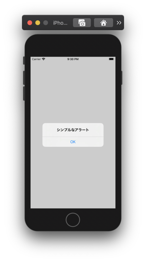
(1) タイトルとOKボタンのみのシンプルなダイアログ
struct ContentView: View {

    @State private var showAlert = false

    var body: some View {
        Button(action: {
            self.showAlert.toggle()
        }) {
            Text("アラートダイアログを表示")
        }
        .alert(isPresented: $showAlert) {
            Alert(title: Text("シンプルなアラート"))
        }
    }
}
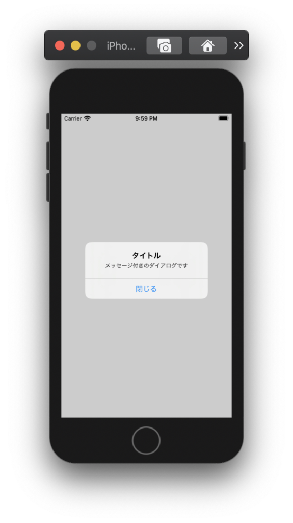
(2) タイトル、メッセージ、任意の閉じるボタンがあるダイアログ
struct ContentView: View {

    @State private var showAlert = false

    var body: some View {
        Button(action: {
            self.showAlert.toggle()
        }) {
            Text("アラートダイアログを表示")
        }
        .alert(isPresented: $showAlert) {
            Alert(
                title: Text("タイトル"),
                message: Text("メッセージ付きのダイアログです"),
                dismissButton: .default(Text("閉じる"))
            )
        }
    }
}
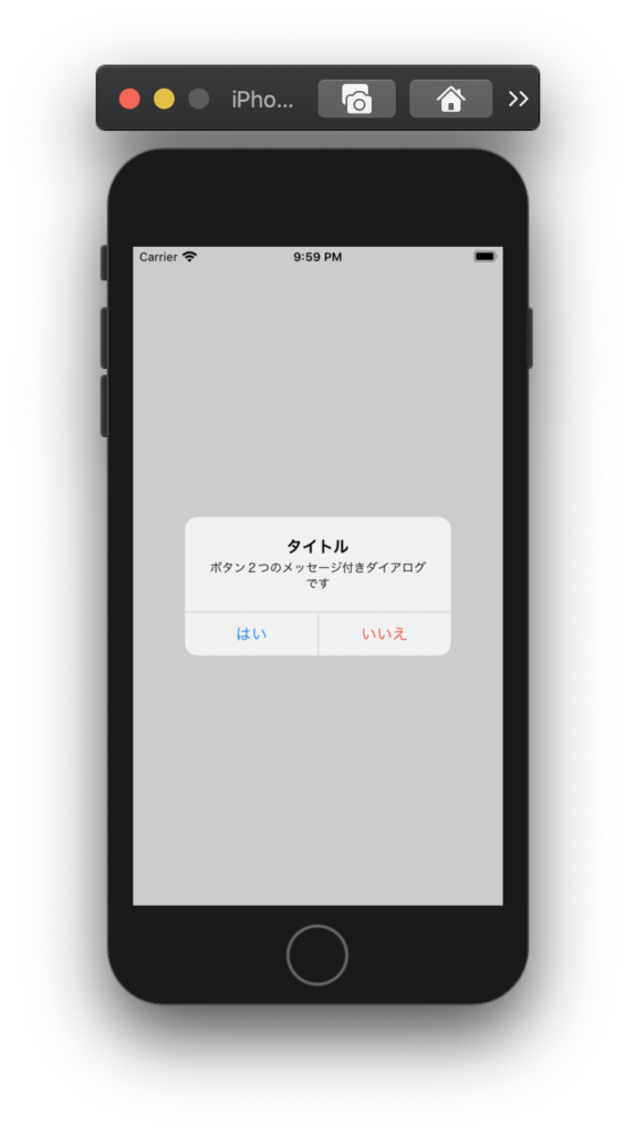
(3) 2つのボタンがある選択肢ダイアログ
struct ContentView: View {

    @State private var showAlert = false

    var body: some View {
        Button(action: {
            self.showAlert.toggle()
        }) {
            Text("アラートダイアログを表示")
        }
        .alert(isPresented: $showAlert) {
            Alert(
                title: Text("タイトル"),
                message: Text("ボタン2つのメッセージ付きダイアログです"),
                primaryButton: .default(Text("はい")),
                secondaryButton: .destructive(Text("いいえ"))
            )
        }
    }
}
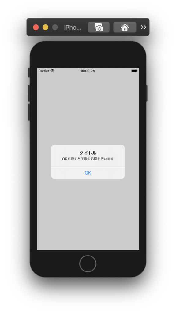
(4) ボタン押下時のクロージャを設定するパターン
struct ContentView: View {

    @State private var showAlert = false

    var body: some View {
        Button(action: {
            self.showAlert.toggle()
        }) {
            Text("アラートダイアログを表示")
        }
        .alert(isPresented: $showAlert) {
            Alert(
                title: Text("タイトル"),
                message: Text("OKを押すと任意の処理を行います"),
                dismissButton: .default(Text("OK"), action: {
                    print("任意の処理")
                })
            )
        }
    }
}
以上、アラートダイアログについてのまとめでした。
以下の関連記事もご参考下さい。


コメントを残す